
Lightroom Basics #2: Exploring the Presence Panel
In the first post in this series, we established that editing isn’t about “fixing” an image, rather it is about working through a series of controlled adjustments to better align the final result with your intent. Those initial steps create a baseline. The Presence panel builds on that foundation, allowing you to refine how the image is perceived by adjusting texture, contrast, and color intensity in a more deliberate way.
Note: This Lightroom series is designed to provide an overview of each of the panels in Lightroom Classic. There is much more to say about each panel but, if you are just looking to jump into editing, this series will get you started. Also, I shared a few cautions about editing in part 1, so be sure to check it out to set the stage for part 2.
Contrast
Before we look at the sliders in the Presence panel, let’s define contrast. With respect to editing, contrast is defined as the separation between dark and light tones. High contrast creates dramatic, bold images, while low contrast produces soft, subtle, or vintage styles. This is represented in the 2 images below - the image on the left is adjusted for low contrast, while the image on the right is adjusted for high contrast. Notice how the low contrast images appears flat compared to the more punchy high contrast image.
“High contrast creates dramatic, bold images, while low contrast produces soft, subtle, or vintage styles.”
The Presence Panel:
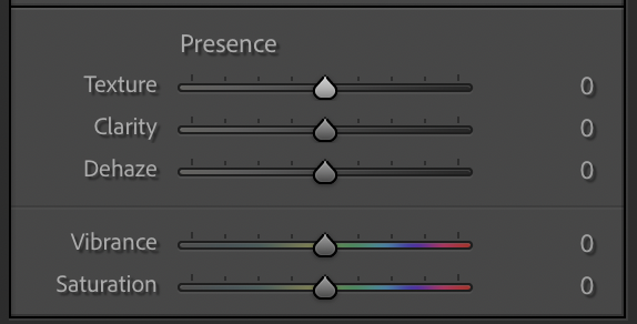
Texture: Fine Detail Control
Texture enhances (or softens) small-scale detail without dramatically affecting overall contrast.
Increase texture to bring out fine detail.
Decrease texture to smooth surfaces.
Experiment: Push texture higher than you think is reasonable, then pull it back. The “right” value is usually just before it starts to look artificial.
Clarity: Midtone Contrast
Clarity adjusts contrast in the midtones, which gives an image more “punch.”
Positive clarity adds depth and structure
Negative clarity creates a softer, dreamlike effect
Note: Be careful here as too much clarity can quickly make an image feel harsh or overprocessed.
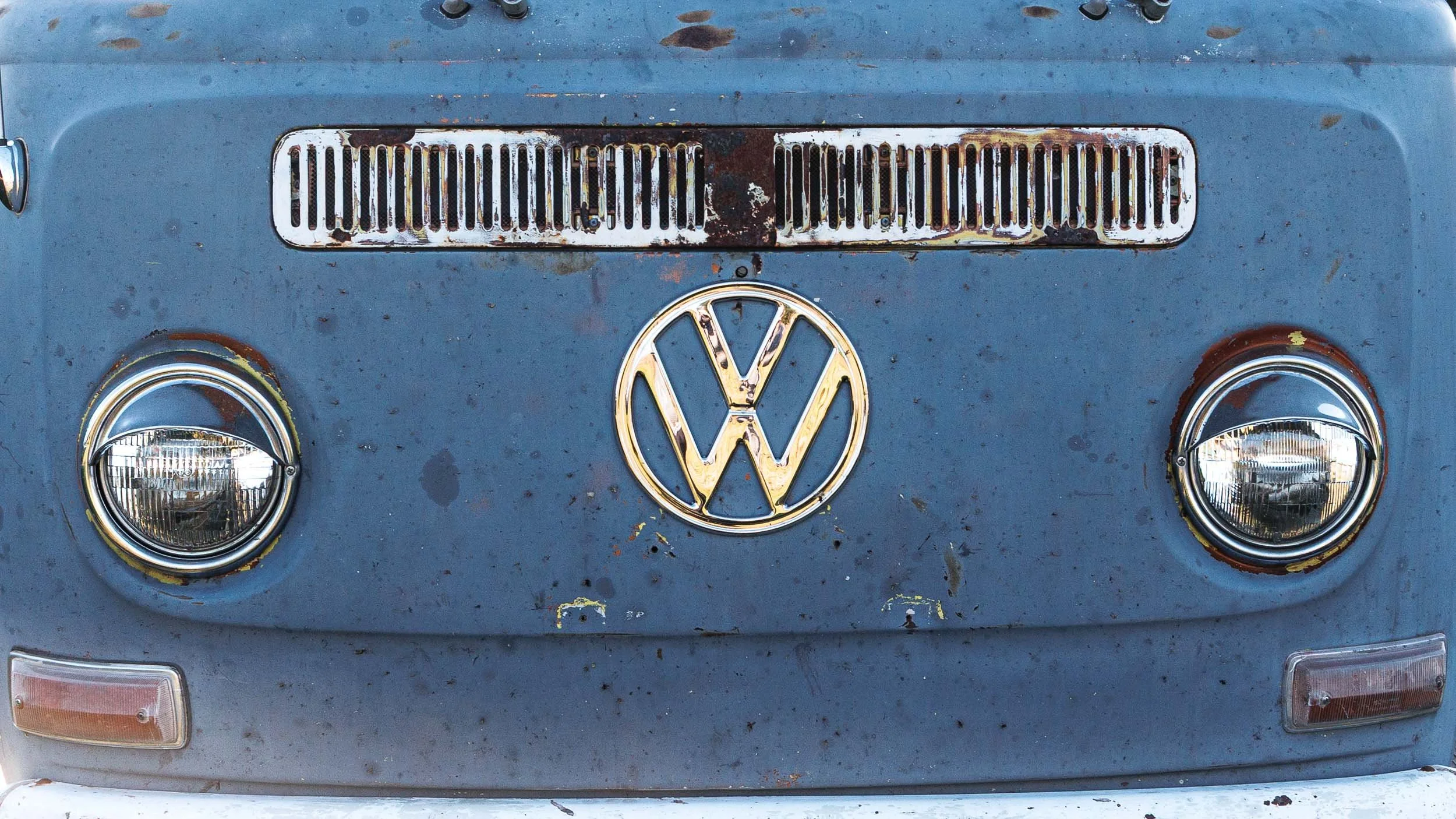
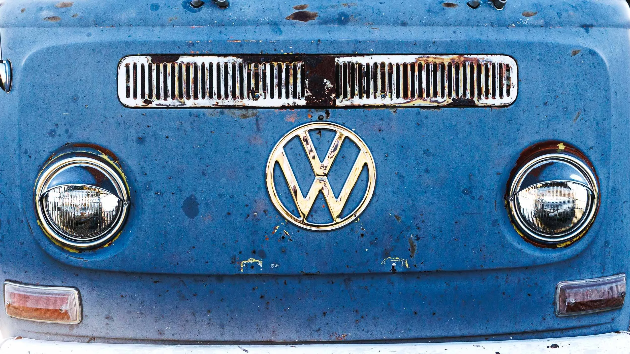
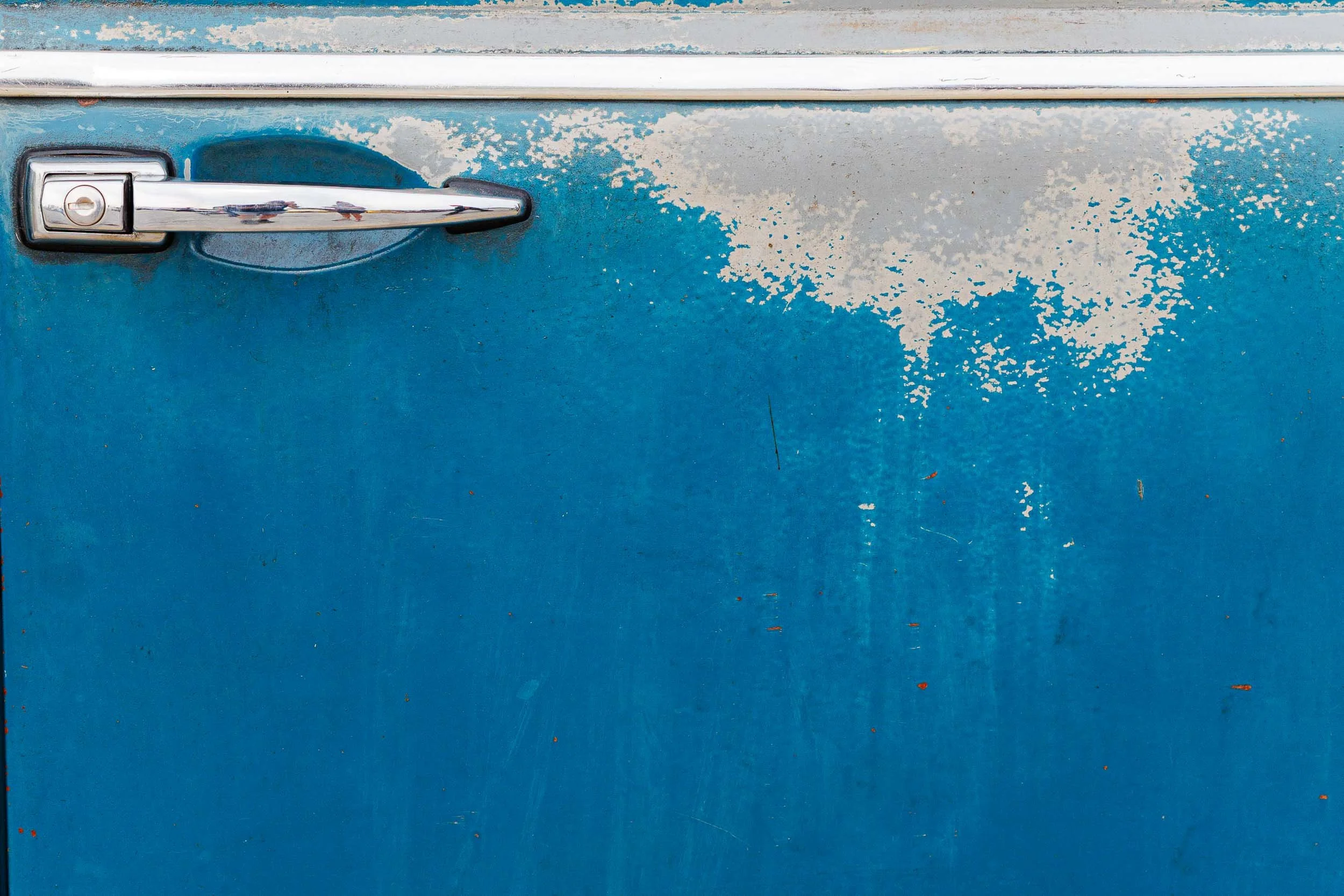
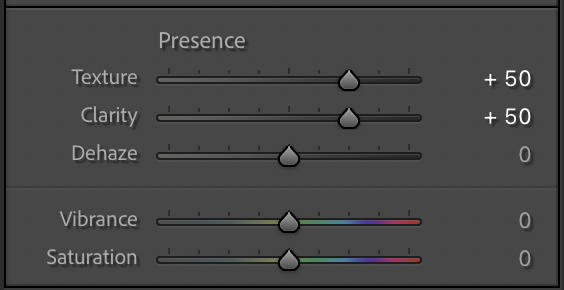
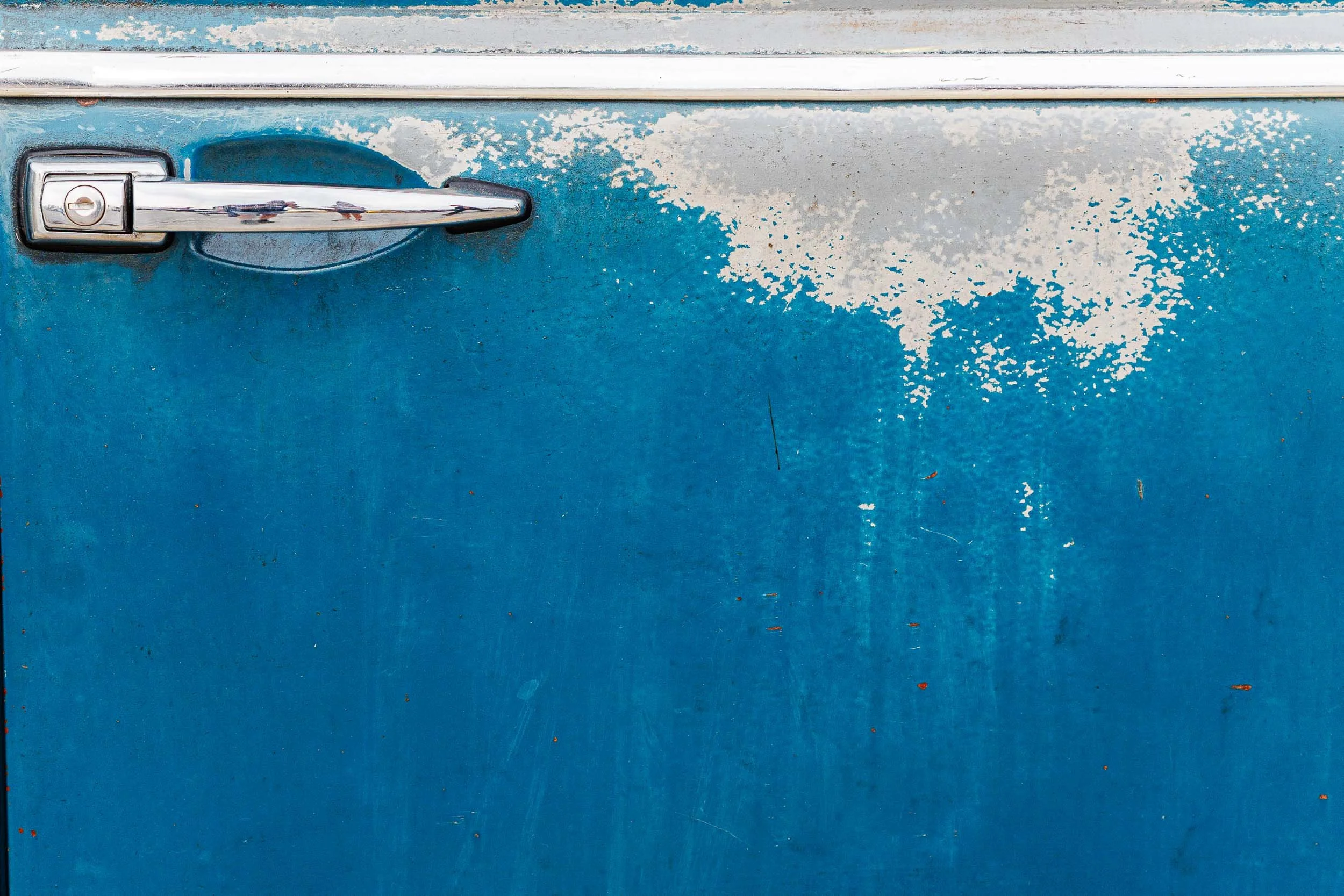
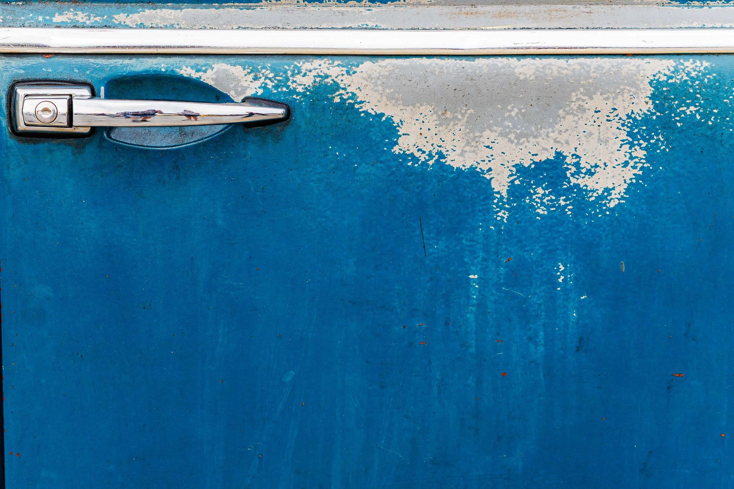
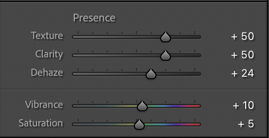
Here is an example (note that I’ve added more texture and clarity than I might otherwise just to make the effects of each more obvious): From left right, the base image from Post #1 adjusted for exposure, tone, and color; the texture adjustment; the texture and clarity adjustment. Notice how the fine detail in the paint increases as texture and clarity are boosted.

Dehaze: Cutting Through Atmosphere
Originally designed to reduce haze, this tool also acts as a powerful contrast and color adjustment. It’s a strong adjustment so small movements go a long way.
Increase dehaze to recover contrast in foggy or flat scenes
Decrease it slightly for a softer, atmospheric look
Experiment: Try a slight negative dehaze on backlit scenes to enhance glow.
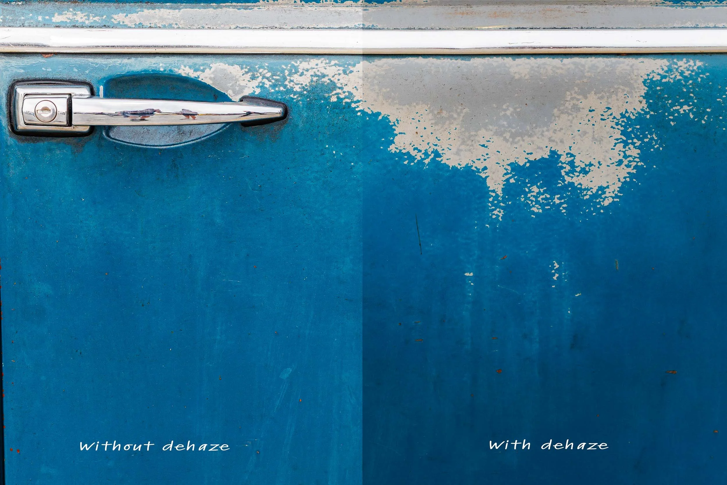
A dehaze adjustment can affect contrast and color
Vibrance vs. Saturation: Controlled vs. Global Color
These two sliders both affect color, but in very different ways.
Vibrance
Increases color intensity selectively
Protects skin tones and already saturated areas
Saturation
Increases intensity across all colors equally
Much easier to overdo
Rule of thumb: Start with vibrance. Use saturation sparingly.
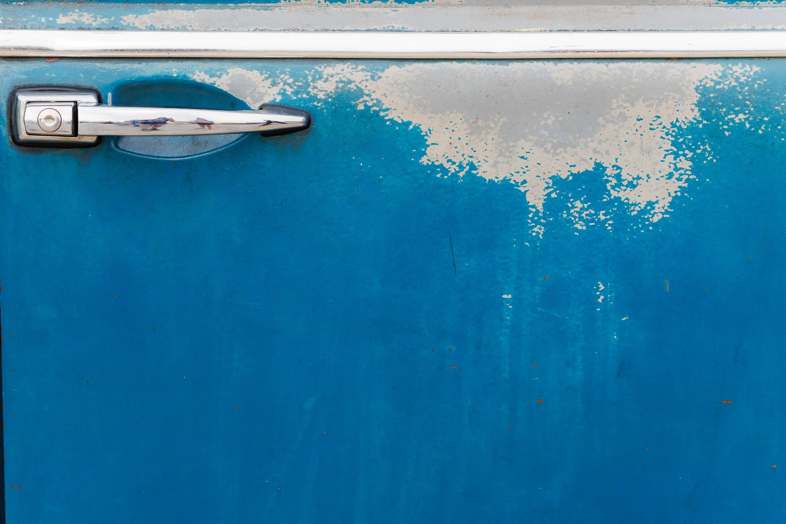
From left to right below: the image adjusted for texture and clarity only, the addition of a vibrance and dehaze adjustment, the addition of a vibrance, dehaze, and saturation adjustment. Again, I’ve pushed these adjustments a bit farther than normal for the sake of illustrating the effect.

Putting It Together
These adjustments are most powerful when used with restraint. It’s easy to stack texture, clarity, and dehaze and end up with an image that feels overworked. Instead, think in terms of intent:
What details should stand out?
Where should the viewer’s eye go?
Should the image feel crisp or soft?
Make one adjustment at a time, evaluate, and refine. The Presence panel is about shaping perception. Small, deliberate changes here can elevate an image without drawing attention to the edit itself. The best use of these tools is often the one you don’t immediately notice.
Masking…
Looking ahead to a discussion of masking, note that the texture, clarity, dehaze, and saturation sliders are all available for use on individual masks, making these tools even more powerful in defining your image.
The Lightroom Basics Series:
#1 Exposure Tone and White Balance
#2 The Presence Panel
Up next: the Tone Curve panel