
Lightroom Basics #3: The Tone Curve
The Tone Curve is one of those tools in Lightroom that can feel a little intimidating at first glance but once it clicks, it quickly becomes one of the most powerful ways to shape the look and feel of your image.
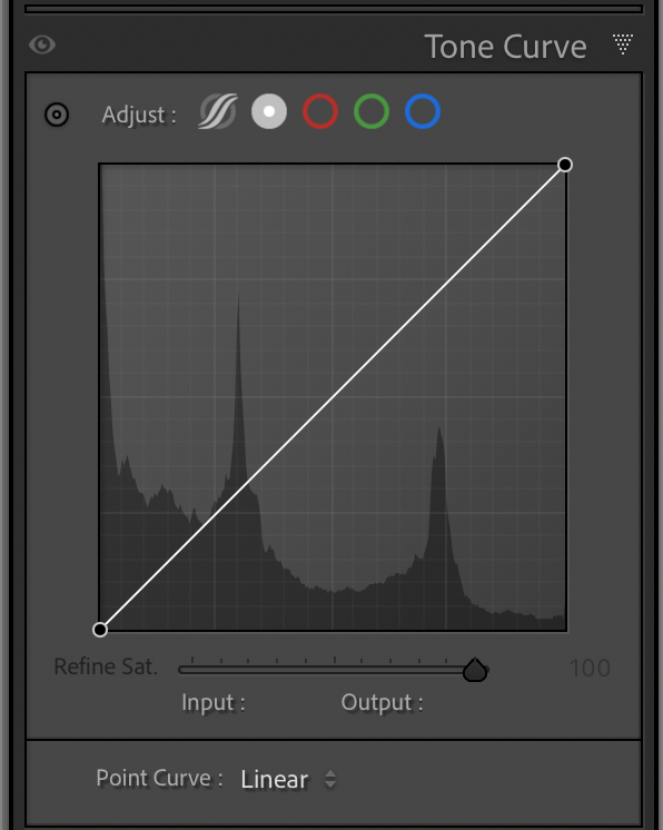
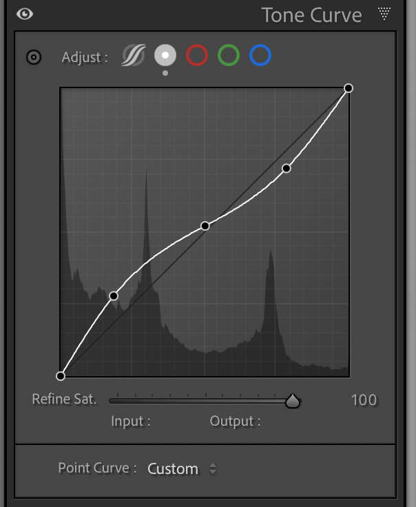
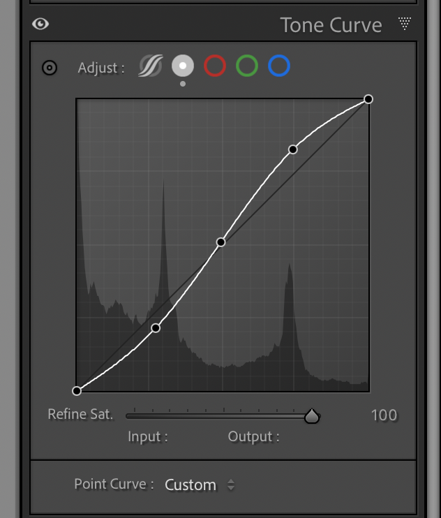
At its core, the Tone Curve controls brightness values across your image’s tonal range, from deep shadows to bright highlights. Instead of moving a single slider, you’re working with a curve that lets you target specific regions. This is what makes it so powerful: you’re not just adding contrast, you’re deciding exactly where that contrast lives. If you’ve ever heard of an “S-curve,” this is where it comes into play. By gently pulling down the shadows and lifting the highlights, you create that subtle S shape. The result? Increased contrast, deeper blacks, brighter highlights, and an overall image that feels more dynamic. But subtlety matters here and small adjustments go a long way. A heavy-handed curve can quickly crush shadow detail or blow out highlights, especially in high-contrast scenes. The Tone Curve is more of a fine-tuning tool rather than a blunt instrument; however, certain images may lend themselves to more of a heavy hand.
One of the most useful techniques is anchoring your midtones. By placing a point in the middle of the curve and leaving it mostly untouched, you can adjust shadows and highlights independently without shifting the overall exposure too much. This is especially helpful when you want to add contrast while preserving the natural look of your subject.


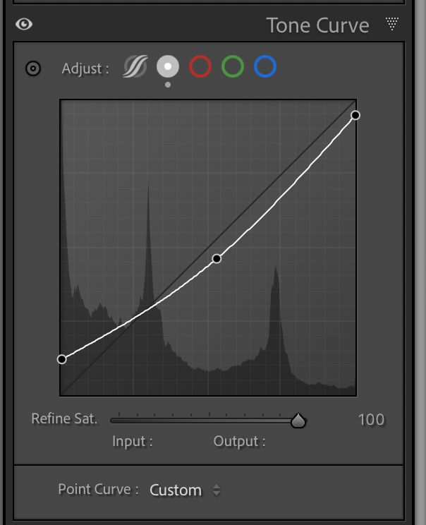
Another approach is lifting the blacks slightly by raising the far-left point of the curve. This creates a softer, matte look by preventing true blacks. It’s a stylistic choice, but when used thoughtfully, it can add a subtle, film-like quality to an image.

Make it stand out
Create a matte look by slightly raising the far left point (blacks). Here I’ve also lowered the far right point (whites).
The Tone Curve also pairs really well with the Basic panel. I’ll often start with exposure, contrast, highlights, and shadows to get things in the right ballpark, then move to the Tone Curve to refine the contrast more precisely.
As with most tools in Lightroom, the key is experimentation. Try adding a gentle S-curve, then toggle it on and off to see the difference. Pay attention to how it affects mood and depth, not just brightness. Over time, you’ll start to recognize when an image needs that extra bit of contrast shaping that only the Tone Curve can provide.
In the next post in this series, we’ll build on this foundation and explore the individual color channels where the Tone Curve really starts to unlock creative color grading possibilities.